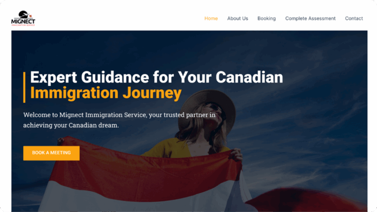
Mignect Immigration Service - Expert Guidance for Your Canadian Immigration Journey
Goal
- Improve user experience (UX) through clearer content hierarchy, better navigation, and simplified user flows.
- Elevate the user interface (UI) with a more professional and visually cohesive design.
- Strengthen brand identity to resonate with Mignect’s target audience (families, professionals, students).
- Make key services and call-to-actions more accessible to boost inquiry and conversion rates.
- Optimize for mobile responsiveness and SEO to improve reach and usability across devices.
Project Overview
To redesign the entire website, transforming it into a modern, intuitive, and professional online platform that reflects the trustworthiness and expertise of the Mignect brand.
My Role & Responsibilities
Conducted a site audit to evaluate UX pain points and aesthetic inconsistencies
Redesigned the entire UI, from layout and typography to spacing, color, and content structure.
Collaborated closely with the CEO to refine the copywriting, ensuring it sounded both professional and compassionate.
Rebuilt the page structure to guide users more naturally toward conversion points (consultation forms, service details, contact).
Ensured responsive design across devices and browsers.
Integrated performance improvements for faster loading times and smoother interactions.
Challenges & Solutions
Challenge 1: Cluttered Content and Navigation
The original site overwhelmed users with too much information crammed into inconsistent layouts.
Solution: I restructured the content into digestible sections with clear headings and created a more intuitive navigation bar. Key services were categorized and prioritized to reduce cognitive load.
Challenge 2: Limited Mobile Optimization
Mobile experience was poor, with layout breakages and long load times.
Solution: I implemented a fully responsive layout and optimized images and scripts to ensure fast, smooth performance on all devices.
Challenge 3: Weak Visual Identity
The brand lacked visual consistency, with conflicting colors, fonts, and misaligned spacing.
Solution: I introduced a calm, trustworthy color palette (featuring navy blues and gold accents), consistent font styles, and spacious containers that allowed the content to breathe.
Key Improvements Made
- Complete visual overhaul using a modern, clean, and responsive design system.
- Created a clear information architecture and content strategy.
- Rewrote copy for better readability and user trust.
- Designed compelling calls-to-action (CTAs) to guide users toward consultations and service inquiries.
- Integrated a testimonial section, FAQs, and service-specific pages for enhanced trust and transparency.
- Improved accessibility with better contrast, font sizes, and alt texts.
Tools & Technologies Used
Design: Figma, Adobe Illustrator
Development: WordPress (Custom Theme), Elementor
Project Management: Trello, Telegram
SEO: Yoast SEO
Analytics: Google Analytics
Olawunmi Fayemi
Founder & CEO at Mignect Immigration Service
Next Steps
- Content Marketing Strategy: Including blog integration and lead capture tools.
- Automation for Client Intake: Streamlining how potential clients book consultations and submit documents.
- Multilingual Support: Expanding accessibility for non-English-speaking visitors.
Results & Impact
Higher Engagement: Bounce rate dropped by over 30%, and users spent significantly more time on service pages.
Increase in Consultation Requests: Within the first month post-launch, the website saw a 55% increase in inquiries via the contact and consultation forms.
Mobile Usability Score improved dramatically, with a smoother and faster experience across smartphones and tablets.
Positive feedback from users highlighted the site’s ease of navigation and professionalism.
Final Thoughts
This project reaffirmed my belief in the power of intentional design, strategy, and how they can directly support meaningful business goals.